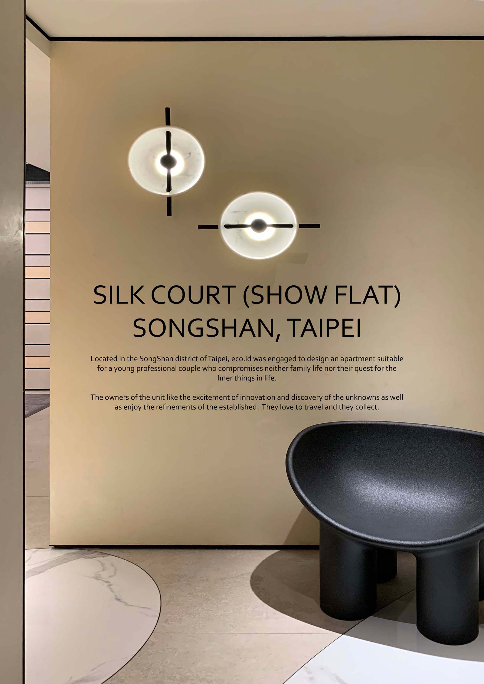
“What seems like a paradox to us can be a solution and we were inspired by Leonardo Da Vinci who said “Simplicity is the ultimate sophistication” and by the Modernist American artist Frank Stella’s “The Curve wants to have space”.
eco.id considered the space the owners need for entertaining, for family time and for collection. A foyer was created to provide privacy to the unit. The living and dining space is open planned so that social interaction is encouraged.
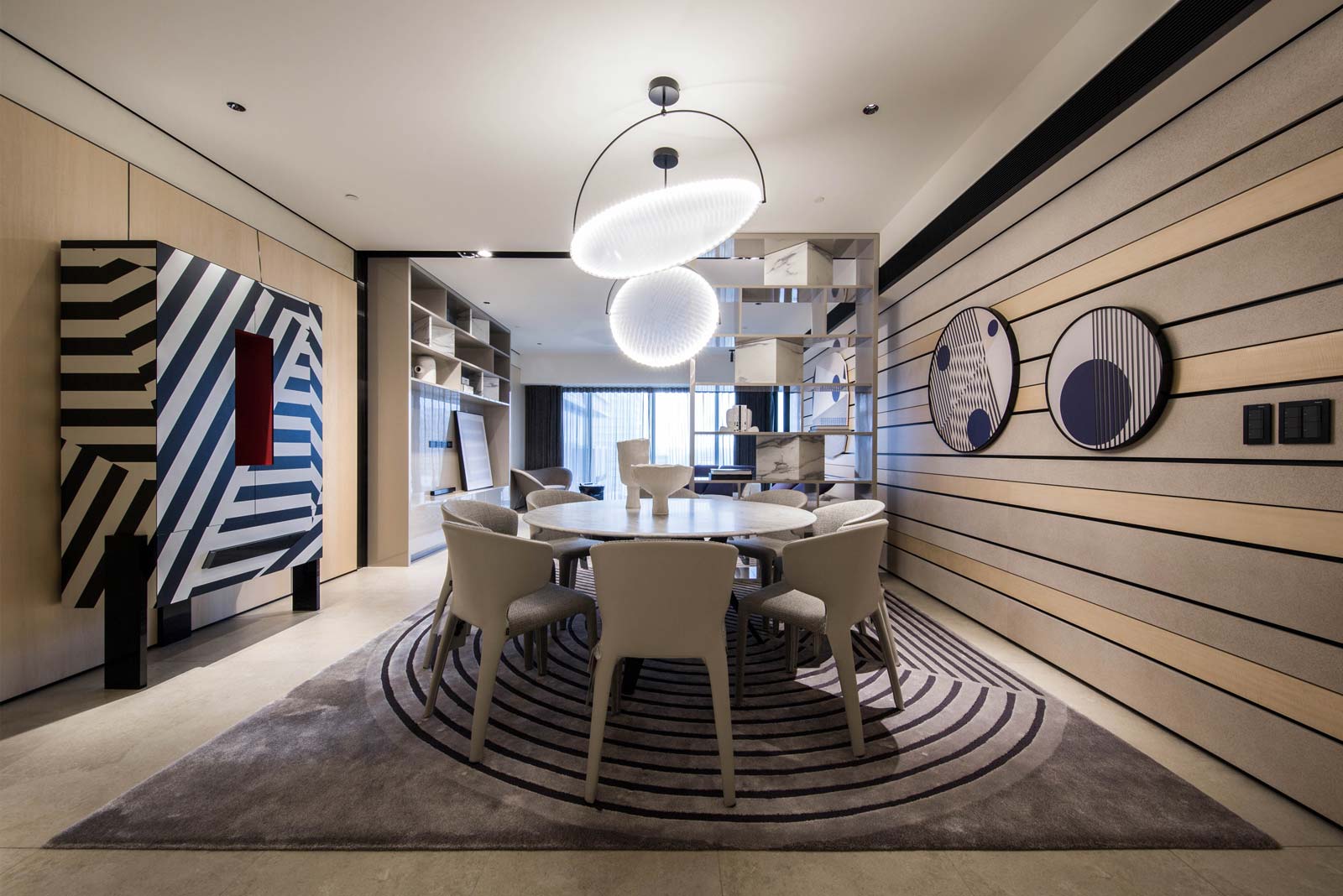
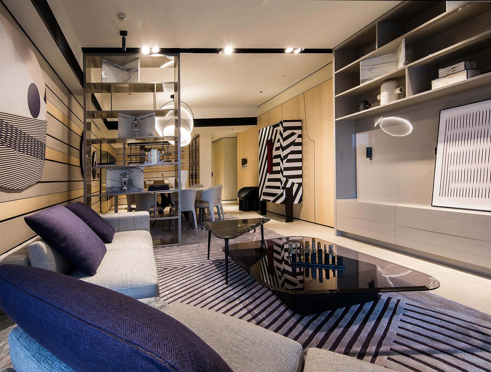
Wall surfaces are designed with bands of panelled beige stone and pearl finish venetian plaster. Hidden tracks in the open joints between the bands hide painting tracks allowing the owners the flexibility of changing their wall art, and open display shelves were introduced for artefacts.
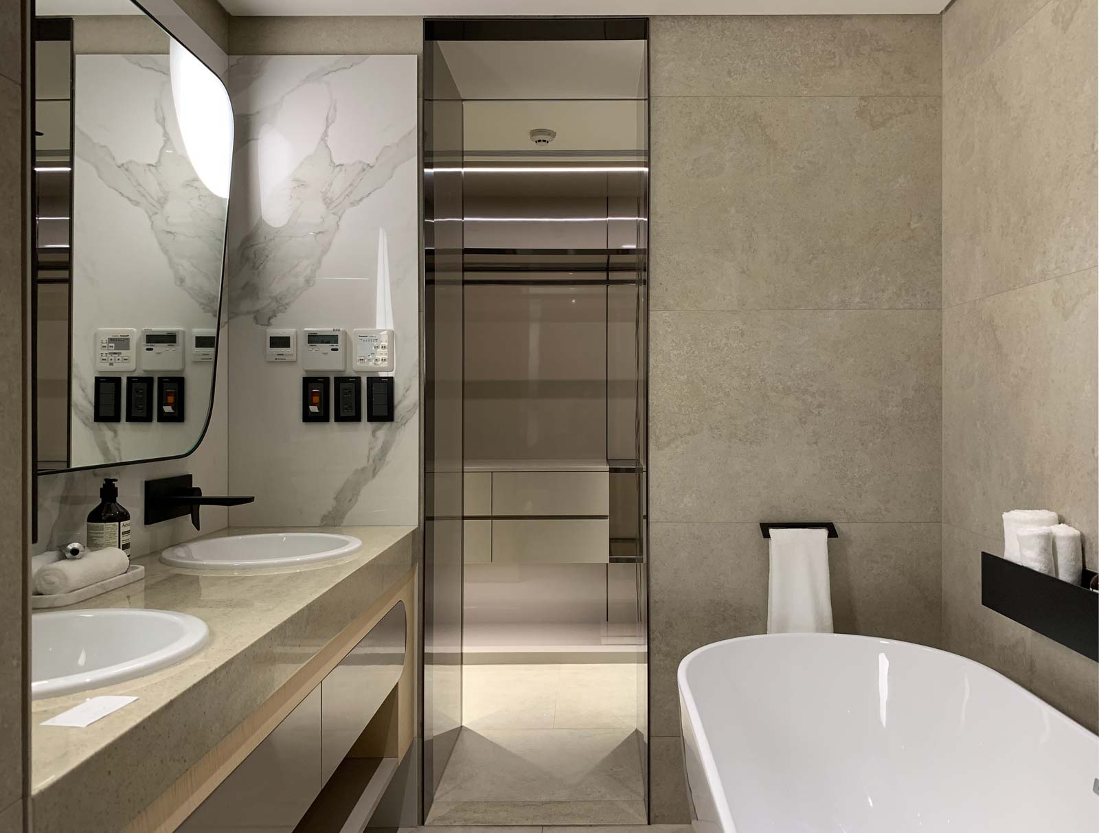
“All hard finishes in the apartment is kept in light and neutral tone-on-tone palette. This neutrality forms a canvas allowing the colours of the art and collection to create seasonal changes according to the owner’s collections.”
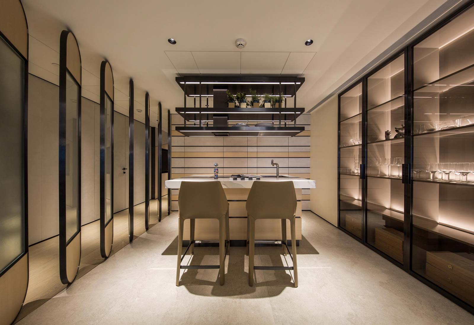
The kitchen island counter is perfect for tasting sessions with friends or meal preparation. Glass display cabinets showcase the gin collection and keep out the hands of the young ones. Furniture selections are contemporary with soft curves that are child friendly.
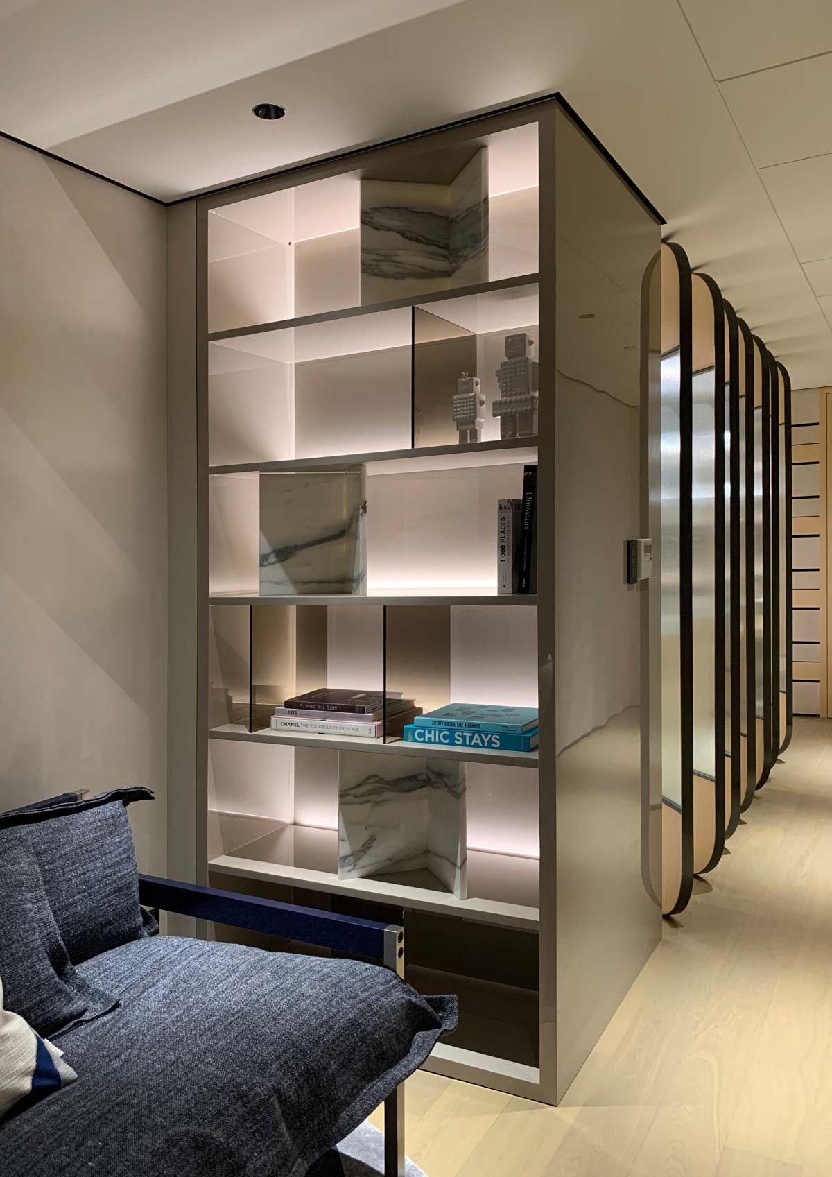
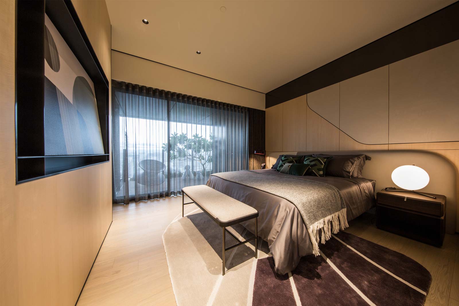
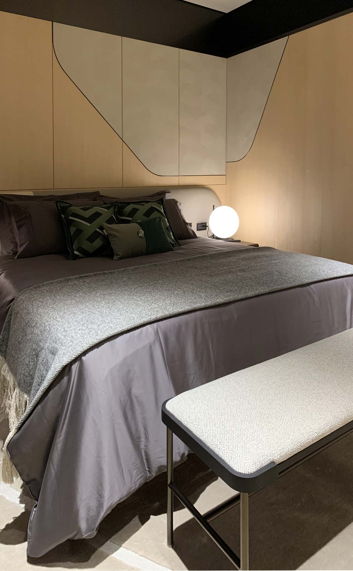
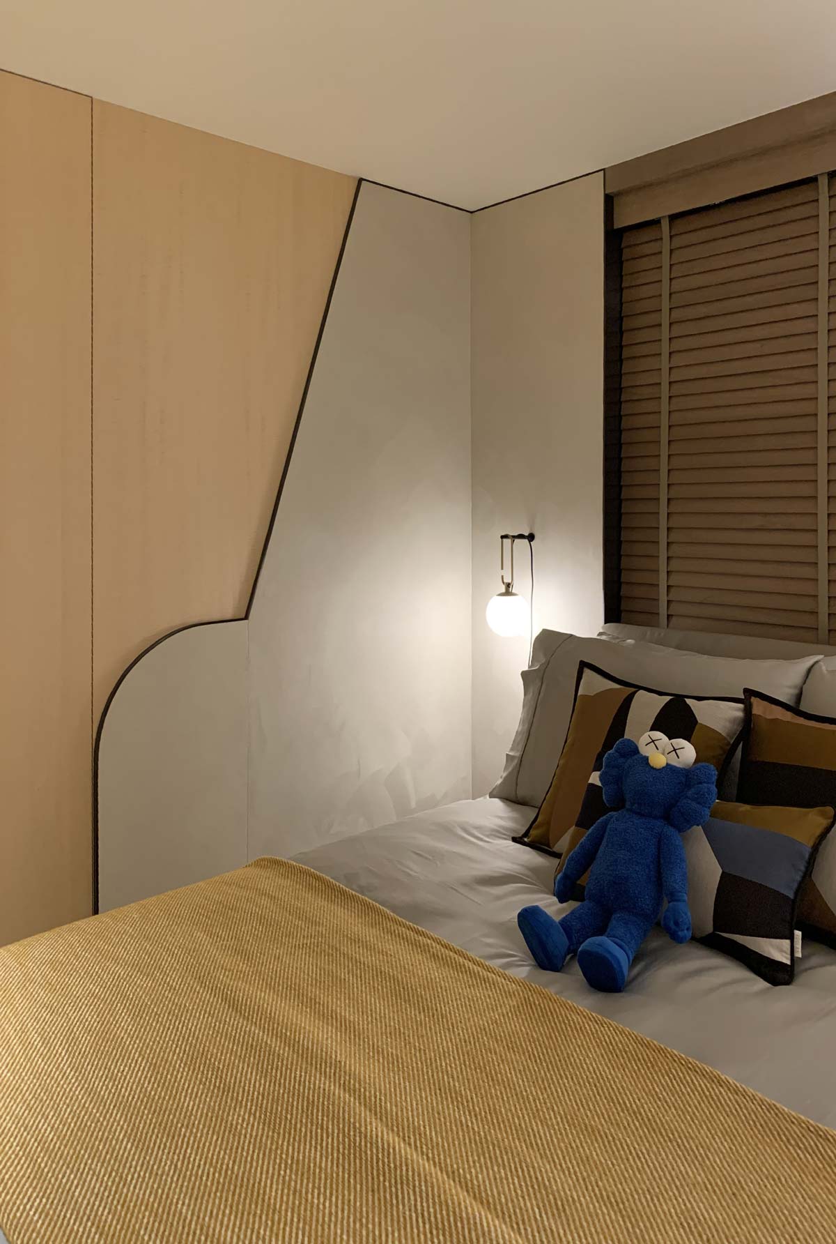
A cosy family nook allows the parents to entertain without depriving the child from a lounge area to hang out. Materiality and tactility is subtle on touch surfaces of the bedrooms walls by combining Alcantara® with sycamore veneer.
